

Personal project · Microsoft · 2026
75 years of LEGO, told one color at a time
- Industry
- DataViz · International competition
- Duration
- 7 days
- Role
- Analysis, design, and development of the report
- Team
- 1 person
- Tools
- Power BI · Deneb · Vega-Lite · Power Query · DAX · Rebrickable
- Scope
- From the data model to the published report
Challenge7 days, a LEGO catalog, and 159 entries
The second round of the Power BI DataViz World Champs started from a LEGO dataset built with public data from Rebrickable. The brief was to tell a story, not build yet another dashboard. We had 7 days, a single file, a maximum of 5 pages, and accessibility made up 25% of the score. A total of 159 entries were submitted from around the world.
The deadline was tight, but the dataset had a lot to offer. It covers 75 years of the LEGO catalog, piece by piece.
The rules also set 3 specific conditions: a “Key Takeaway” visible on the cover page, 50 words or fewer and written for a general audience; the Rebrickable credit visible in the report; and at least 3 native Power BI visuals.
In competitions like this, you end up seeing a lot of similar entries: dark backgrounds, big charts, lots of color, and lots of effects. They can work visually, but with 159 reports side by side, it’s hard to stand out.
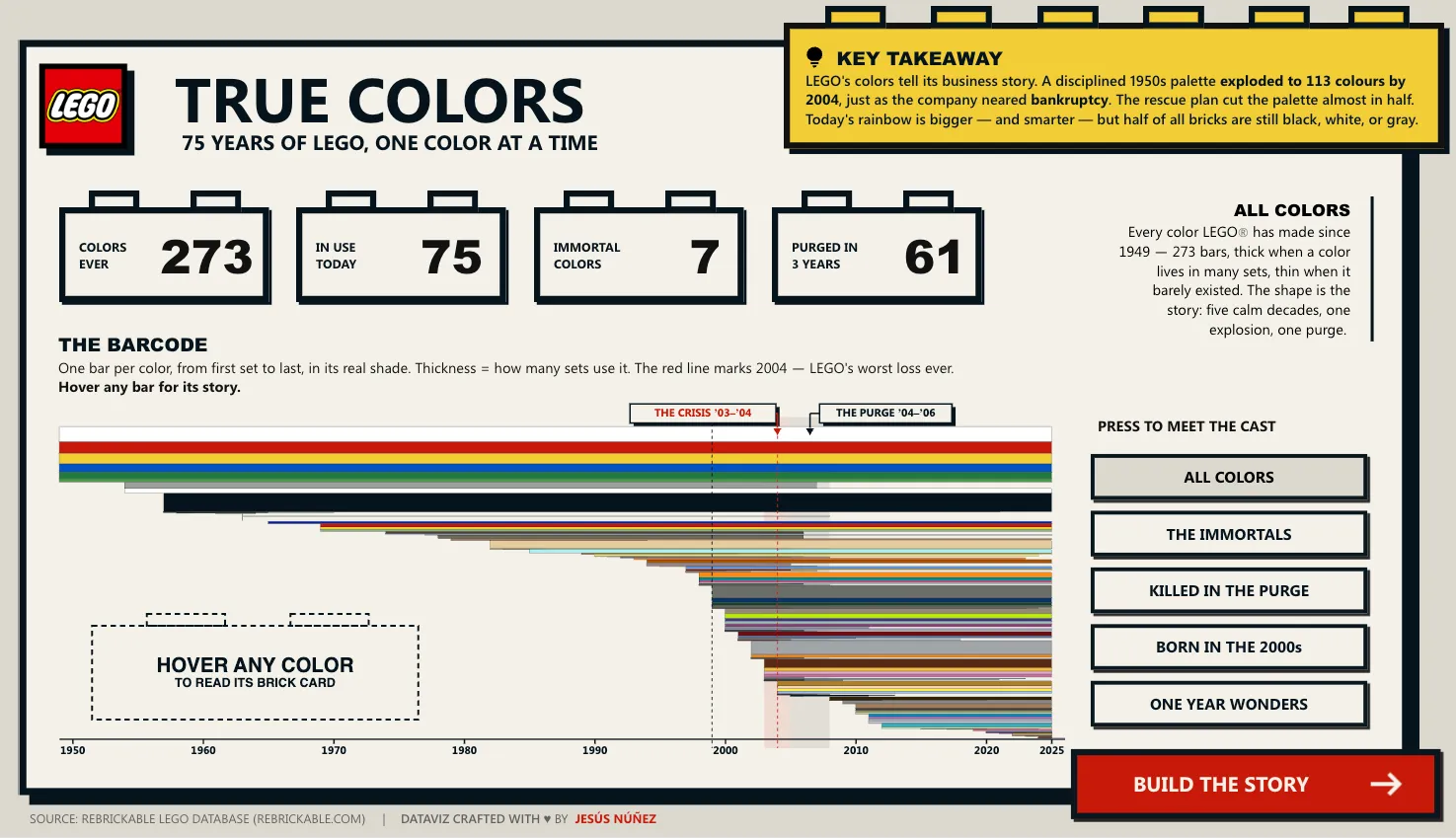
The cover page had to make sense at a glance: the required headline at the top right, the 4 key figures, and, below them, the full barcode.
StoryFrom 3 colors in 1950 to 113 in 2004
LEGO’s catalog says a lot about how the company has evolved. In 1950 there were only 3 colors. By 2004 there were 113, the very year LEGO came close to bankruptcy. Then came a major cleanup of the catalog, and in just 3 years dozens of colors disappeared. Today the palette is wider than ever, although roughly half of all pieces are still black, white, or gray.
I built the whole report on that idea: using the evolution of its colors to tell the story of LEGO. First the expansion, then the cutback, and at the end, where things stand today.
The model was built with Power Query and DAX on Rebrickable’s data. The hard part was deciding which stories made it into the report and which were left out.
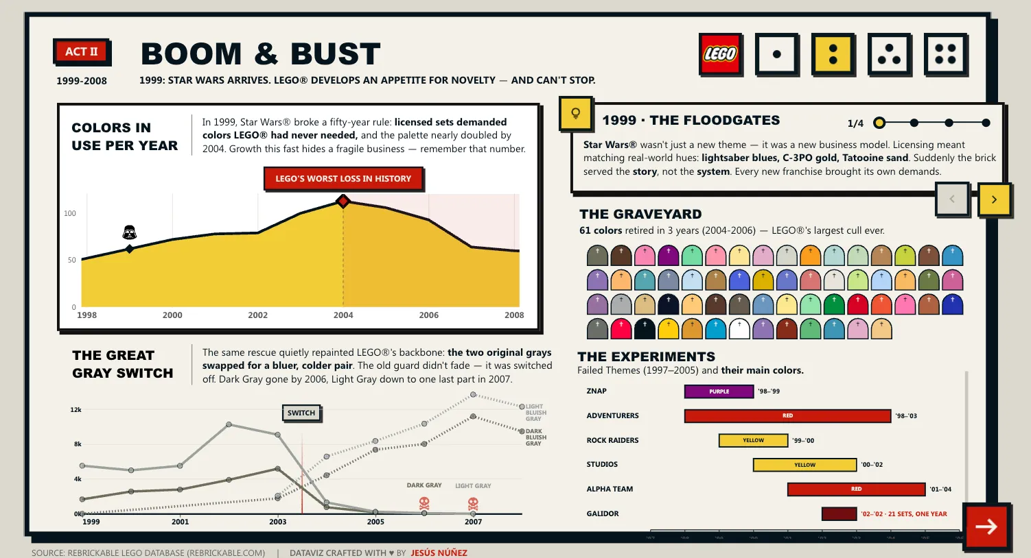
The boom-and-bust moment. The annotation sits on the chart itself, and the graveyard shows the 61 colors that were retired.
DesignA visual language drawn from LEGO catalogs
It took a lot of sketches to land on the visual direction: neo-brutalism, with hard shadows, heavy type, and highly saturated color. The reference was obvious: the LEGO catalogs I grew up building sets with.
The problem is that Power BI, out of the box, goes in exactly the opposite direction: rounded corners, soft gradients, and a friendly look. To bring it into LEGO’s language, I had to treat the whole report as a system, not as a collection of independent visuals.
There are 3 pieces built in Deneb (Vega-Lite): a barcode with 273 stripes, one per color, that responds on hover; the graveyard of retired colors; and the neutrals waffle chart, which shows at a glance how much of the catalog is black, white, and gray.
If the subject is LEGO, the report should invite you to play too. The story can be followed from start to finish, but the interaction adds another layer for anyone who wants to explore.
There are 5 pages: a cover page and 4 acts. The last one works as an epilogue and lets you look up the color tied to your birth year and check whether it survived the purge.
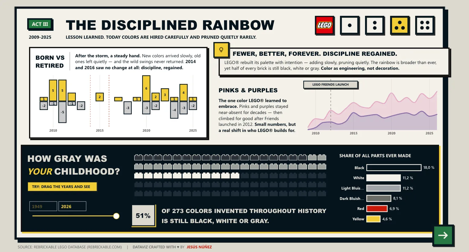
The neutrals waffle, with its year slider for moving through the catalog. It’s one of the views that best shows how, despite having the widest palette in its history, LEGO still relies heavily on neutral tones.
SystemFirst the structure in gray, then the color
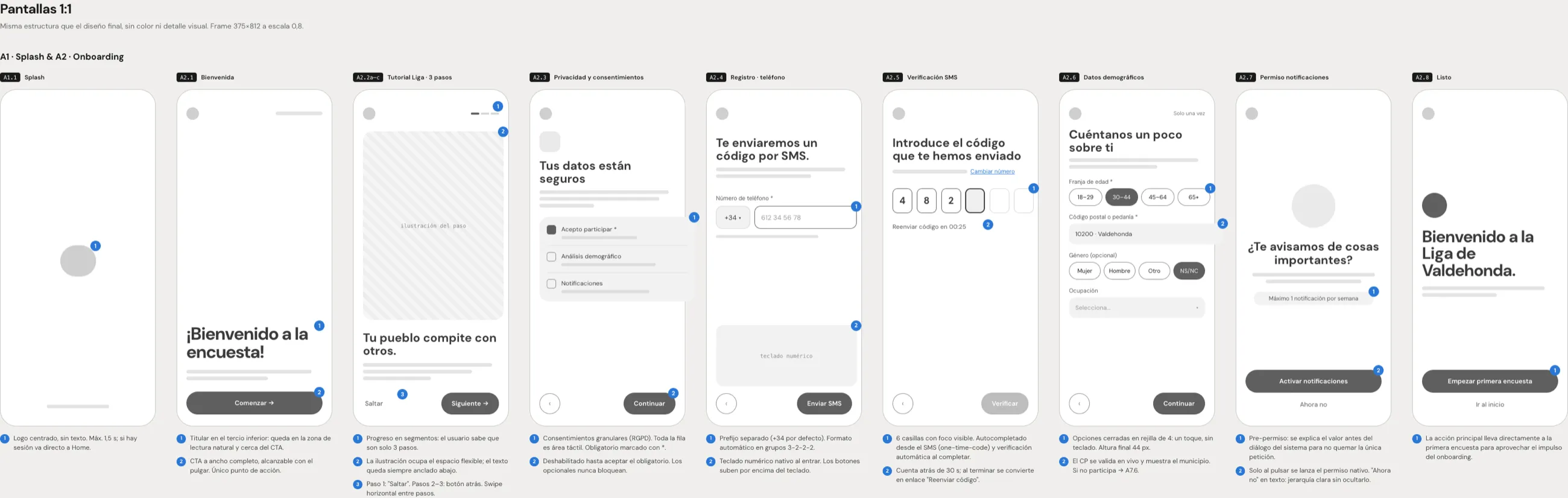
Before thinking about typefaces or colors, I had to solve the structure. All 5 pages were first laid out in gray: where the headline went, how much space the figures took up, which chart was the main one, and where the controls went. Once that was settled, color and type could be applied on top without having to redesign each page.
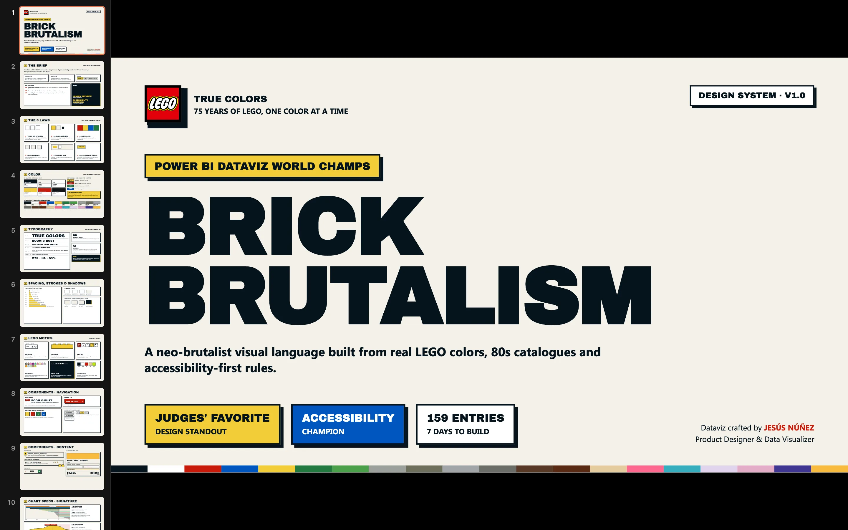
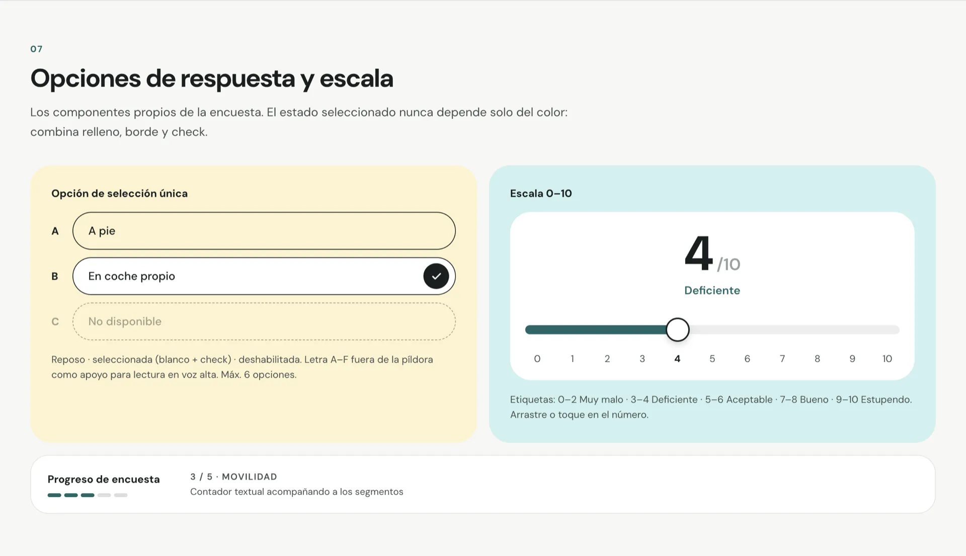
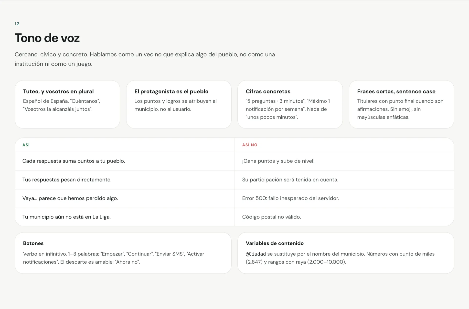
The complete system, slide by slide: the 6 rules, color, typography, the LEGO motifs, the components, and the specs for each chart.
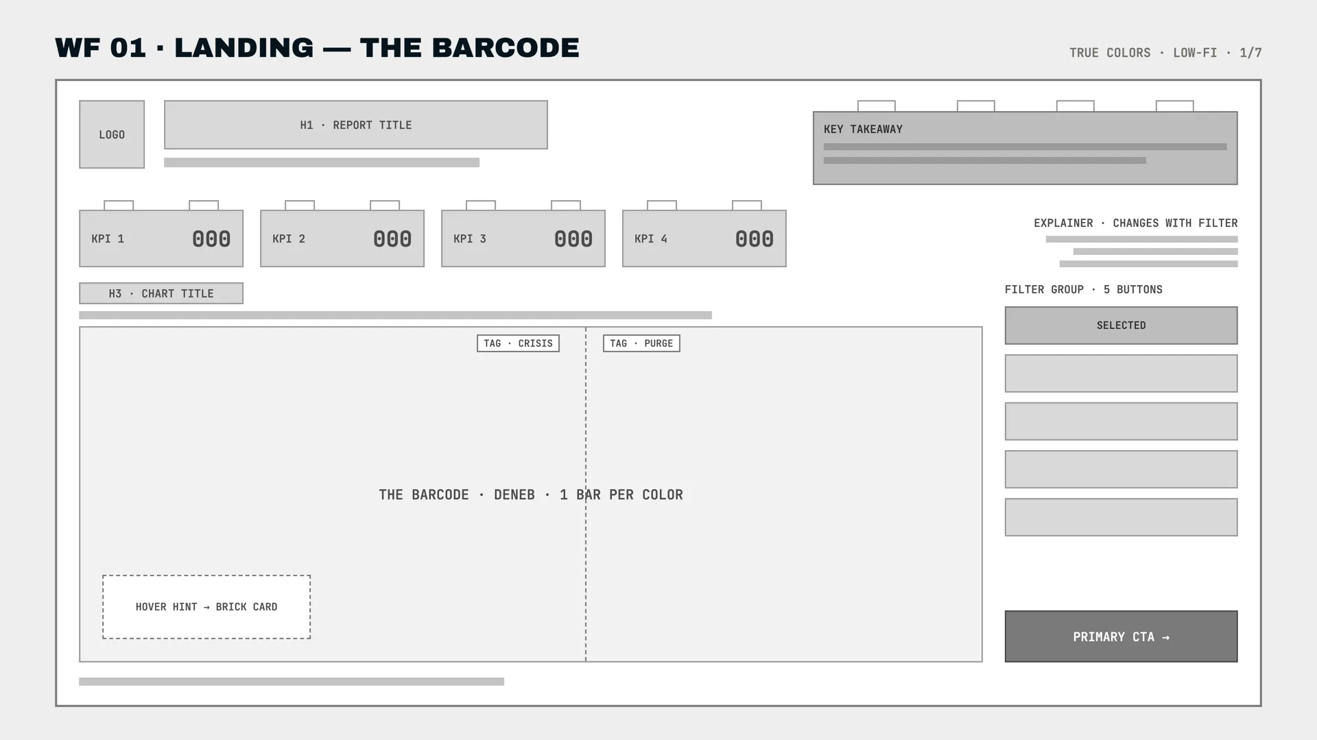
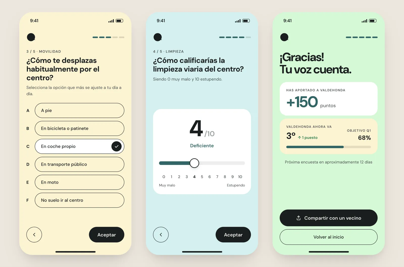
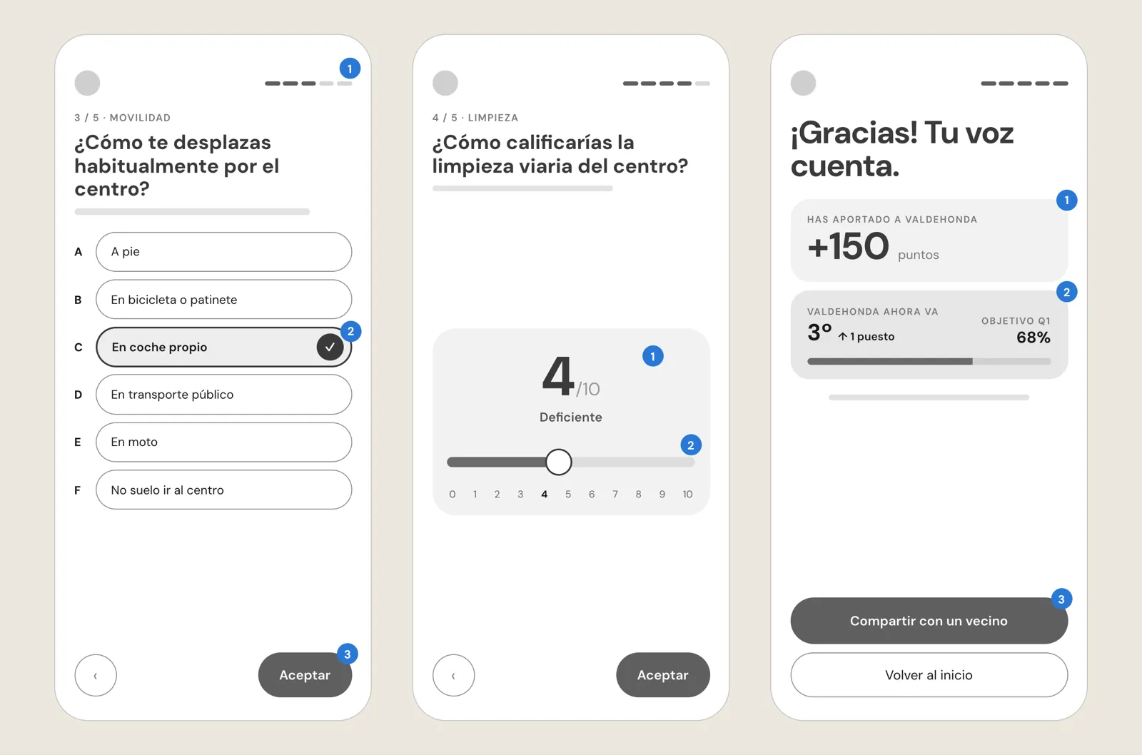
The cover page, before and after. The 4 KPIs were already bricks, and the barcode already took up two-thirds of the width. The structure was settled before color came into it.
The states were also designed before building them in Power BI. A report with story steps, filters, and tooltips ends up with far more states than a screenshot shows, and leaving that part for the end usually means redoing work.
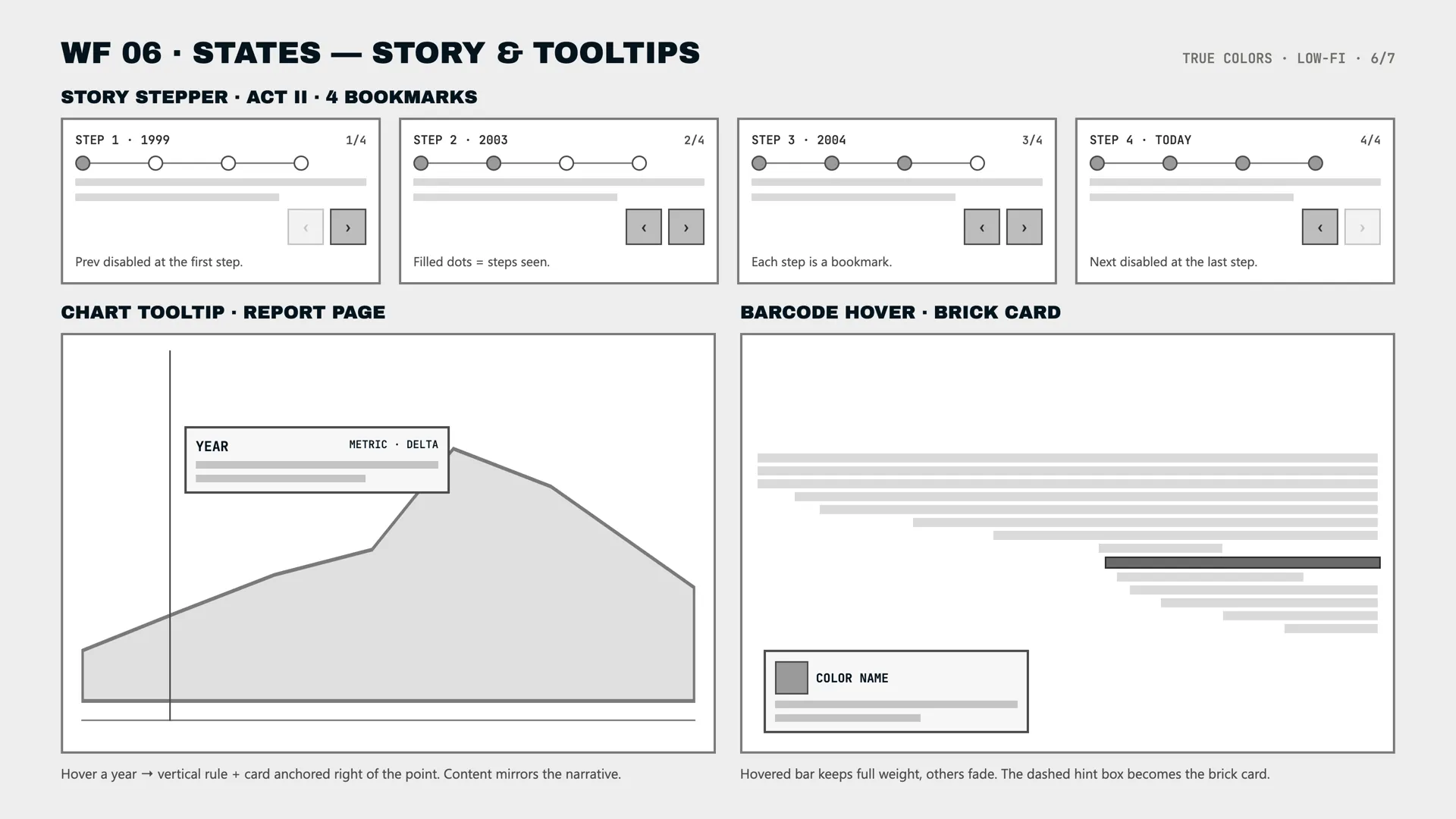
The stepper’s 4 steps and the 2 kinds of tooltip, defined from the start: what gets disabled at either end and what information appears with each interaction.
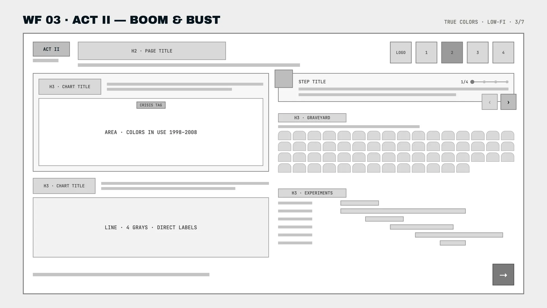
The second act, before and after. The grid stays the same; what changes is the type, the annotations, and the real color of the elements.
The system ended up boiled down to 6 rules: a thick black stroke, square corners except for the brick’s stud, flat color blocks, hard shadows from offset rather than blur, an 8-pixel grid, and focus always visible. With that, all 5 pages share the same language.
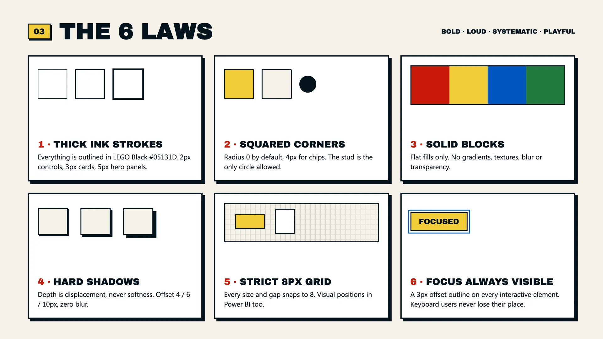
The 6 rules, each with an example alongside. Having them written down makes it possible to check whether a decision belongs to the system or is just a one-off preference.
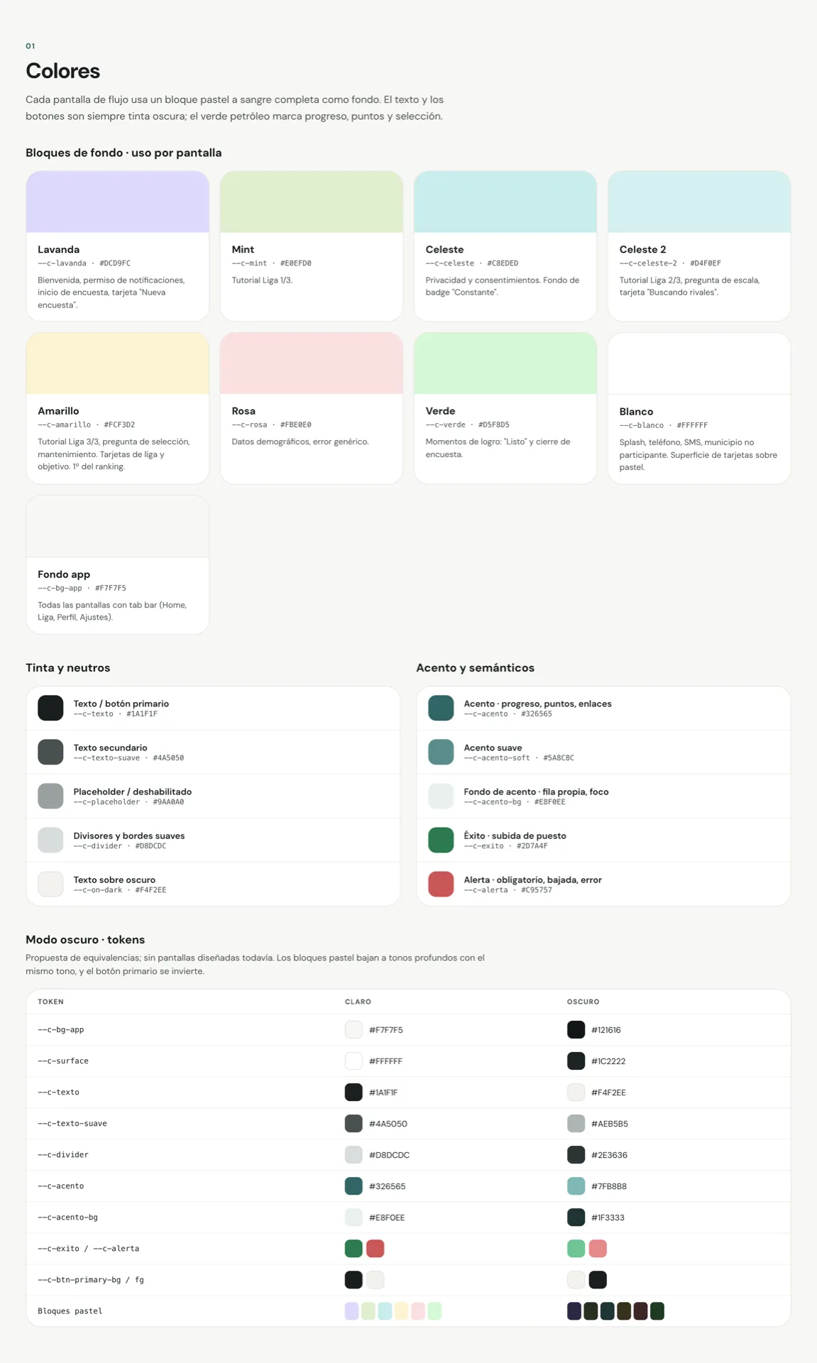
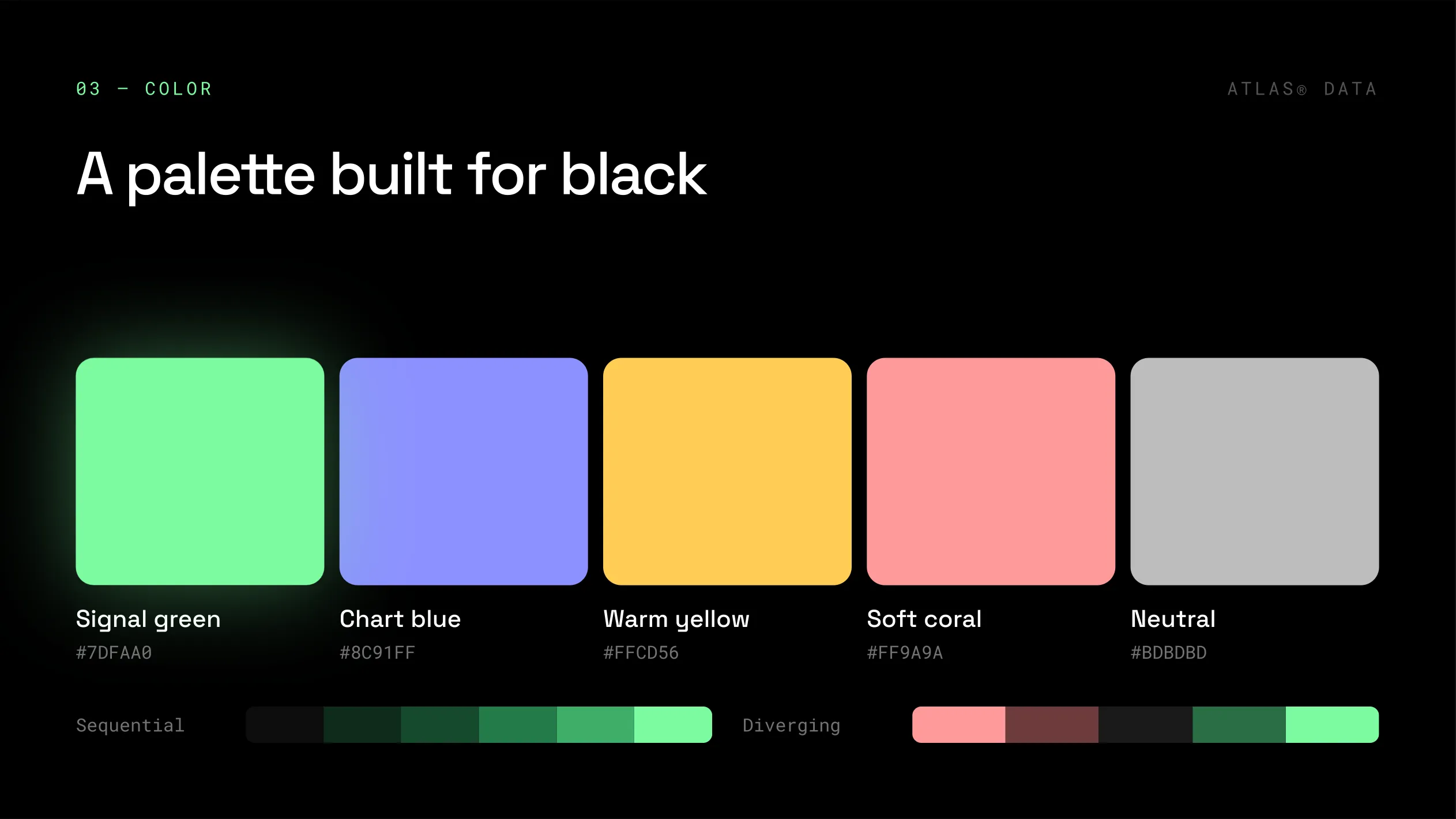
Color also needed a rule of its own, so the report wouldn’t turn into a carnival. LEGO’s colors are reserved for the data; the interface relies mainly on black, yellow, and red. A button doesn’t use the same color as a data bar next to it, because then it’s hard to tell what’s interactive and what’s information.
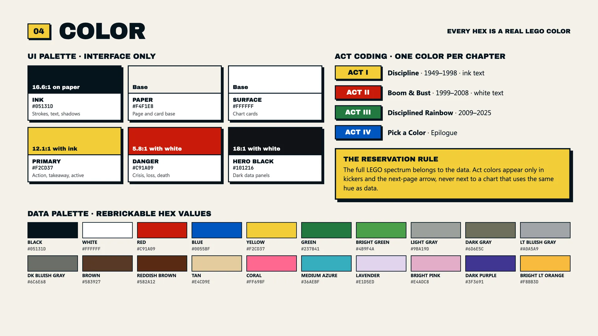
At the top, the interface palette with its measured contrast ratios. At the bottom, the data palette, made up of real colors from the catalog.
The components also start from the brick itself. The big number becomes a 2-stud brick, retired colors appear on a tombstone, the waffle uses 1×2 brick silhouettes, and the navigation between acts uses dice faces. That way the report keeps its identity without filling up with illustrations.
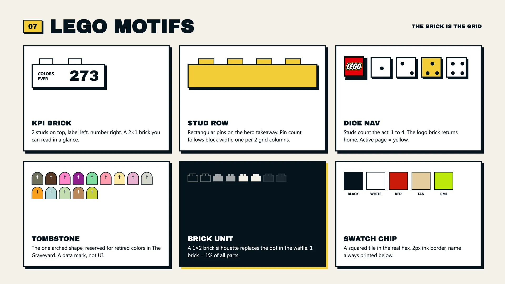
6 motifs drawn from the brick, each with a specific job. The tombstone, for example, is reserved for retired colors and never appears as decoration.
A clarification: these wireframes and sheets were redrawn after the competition to explain the process more clearly. During the working week, the system existed in the sketches and in the report’s own theme.
AccessibilityThe boldest style turned out to be the most accessible
Accessibility made up 25% of the score, but I treated it from the start as part of the design. There’s alt text on every element, some of it generated dynamically, including each brick card, which can describe itself. The reading order follows the visual path, and the whole report can be navigated by keyboard. Contrast was measured too, reaching 16:1 for the main ink, and the grays differ in lightness, not just in hue. The epilogue also includes a lookup table as a text alternative.
The look I had chosen ended up helping accessibility too. Neo-brutalism’s heavy type and high contrast mean the report holds up well when it’s read in a hurry, in dim light, or with low vision. I didn’t have to choose between accessibility and design.
And all of it had to be done in one week. The earlier these decisions enter the process, the less they cost.
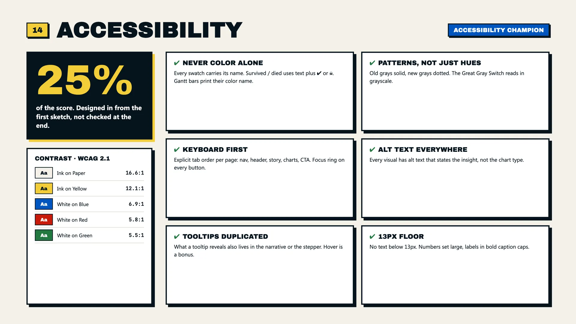
The system’s accessibility sheet: the measured contrast ratios and the 6 rules that all 5 pages had to meet.
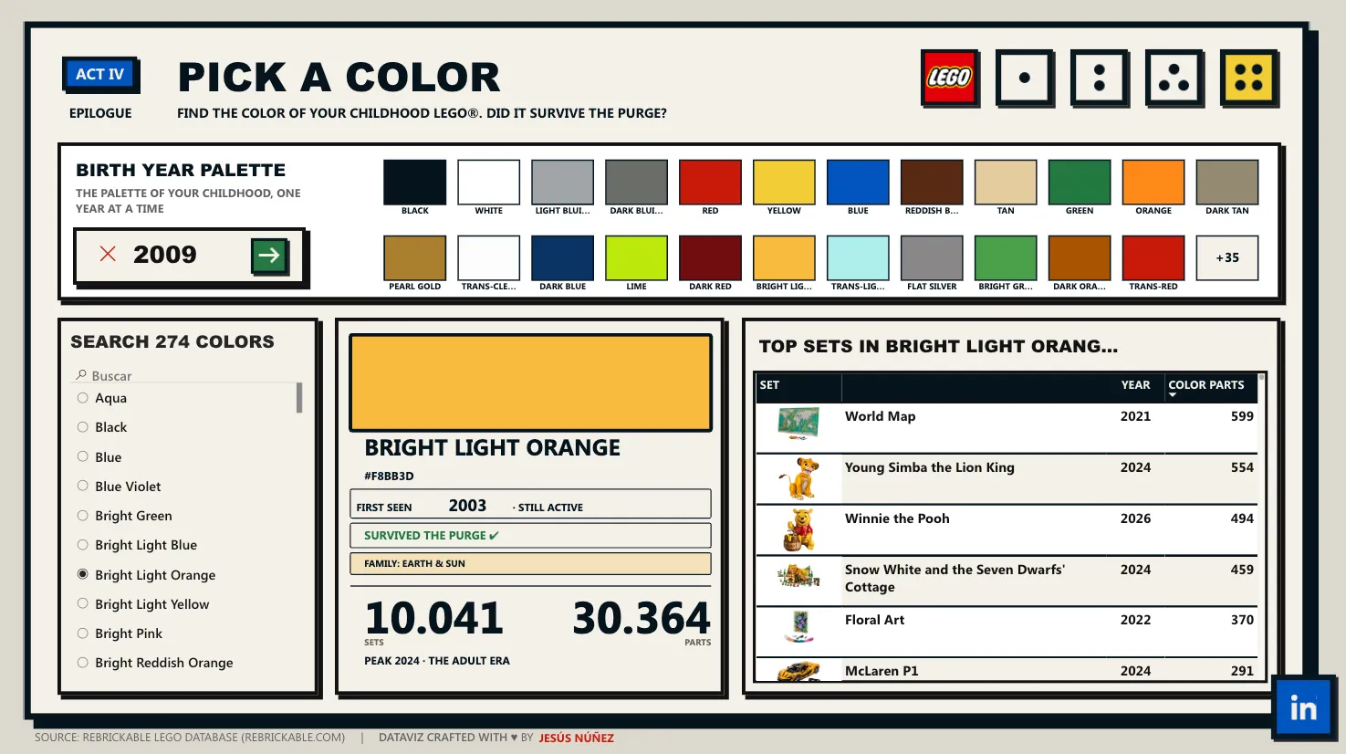
A color’s brick card is the piece that explains itself. Everything important is written out, regardless of color.
Use of AIAI as a tool, not as the author
I used AI quite a lot during the project: to write Vega specs, debug code, and fine-tune the visuals until I reached the final result. It saves me a lot of work, especially on execution tasks. What it doesn’t do is decide which ideas are worth pursuing and which ones to drop, and that’s the part of the process I care about most.
You could see it in the gallery. There were technically very strong entries that, on a closer look, had few decisions of their own behind them. Everything was correct, but it was hard to find a voice.
The judges reached a similar conclusion. In the results announcement, they explain that during deliberations they kept coming back to the entries that had a recognizable point of view and strong editing. Miguel Myers summed it up like this:
AI cannot surpass human creativity.Only a small part of what I tried during the week survived. Trying a lot and throwing out even more is a big part of design work.
OutcomeThe report the judges couldn't stop talking about
“True Colors” earned Judges’ Favorite — Design Standout for the round, with its own section in the results announcement, and made the list of 11 Accessibility Champions among the 159 entries submitted.
The judges for the earlier rounds were Miguel Myers, Principal Program Manager for Fabric Analytics at Microsoft; Paulo Grijó, the 2025 Power BI DataViz world champion; and Shannon Lindsay, Senior Program Manager at Microsoft. These are their assessments, taken from the round’s results announcement and from the email they sent me afterward. They’re quoted as written:
If there was one report the judges couldn’t stop talking about, it was this one.At first glance, True Colors felt bold, unconventional, and unlike almost anything typically seen in Power BI. But the deeper we explored, the more it revealed itself.Every visual choice had purpose, every interaction invited curiosity, and every page rewarded exploration.The neo-brutalist design language, exceptional storytelling, original perspective, and near-perfect accessibility execution combined to create one of the most memorable entries we’ve ever seen in competition.…it unquestionably won a place in the judges’ hearts.It was shortlisted among the very best submissions we received. Out of all entries submitted worldwide, your work ranked in the top 2%.Of everything that came out of that round, the accessibility recognition was the one I cared about most.
And one last story from the project: the file was submitted before dawn, a few hours after Spain won the World Cup. That night of sleepiness and euphoria is part of the project too. It was one of the most enjoyable pieces of work I’ve done in recent years.